
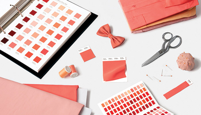
Pantone, provider of professional colour standards and digital solutions for the design industry, recently announced PANTONE 16-1546 Living Coral as the Pantone® Color of the Year 2019, an animating and lifeaffirming shade of orange with a golden undertone. It gets energy from nature. Just as coral reefs are a source of sustenance and shelter to sea life, vibrant yet mellow PANTONE 16-1546 Living Coral embraces us with warmth and nourishment to provide comfort and buoyancy in the continually shifting environment.
In reaction to the onslaught of digital technology and social media increasingly embedding into daily life, the company is seeking authentic and immersive experiences that enable connection and intimacy. Sociable and spirited, the engaging nature of PANTONE 16-1546 Living Coral welcomes and encourages lighthearted activity. Symbolizing our innate need for optimism and joyful pursuits, Pantone 16-1546 Living Coral embodies its desire for playful expression.
Representing the fusion of modern life, Pantone Living Coral is a nurturing colour that appears in natural surroundings and at the same time, displays a lively presence within social media. “Colour is an equalizing lens through which is experienced in natural and digital realities and this is particularly true for Living Coral,” said Leatrice Eiseman, Executive Director of the Pantone Color Institute. “With consumers craving human interaction and social connection, the humanizing and heartening qualities displayed by the convivial Pantone Living Coral hit a responsive chord.”
Pantone 16-1546 Living Coral emits the desired, familiar and energizing aspects of color found in nature. In its glorious, yet unfortunately more elusive, display beneath the sea, this vivifying and effervescent colour mesmerizes the eye and mind. Lying at the center of its naturally vivid and chromatic ecosystem, Pantone Living Coral is evocative of how coral reefs provide shelter to a diverse kaleidoscope of colour.
“Colour enhances and influences the way we experience life,” said Laurie Pressman, Vice President of the Pantone Color Institute. “As a shade that affirms life through a dual role of energizing and nourishing, Pantone 16-1546 Living Coral reinforces how colors can embody our collective experience and reflect what is taking place in our global culture at a moment in time.”
In Social Media
An organic shade, Living Coral is striking in digital mediums, evoking the same inspirational feeling ignited by our natural surroundings. Living Coral’s vibrancy and buoyancy captivates its attention in social media and digital design.
In Fashion and Accessories
Living Coral inspires experimentation and playful expression in both men’s and women’s street and runway styles. The warm shade suggests comfort and positivity in simple colour stories, but becomes more explorative and effervescent in patterns, textures and even monochrome looks. An appealing accent shade, Pantone Living Coral provides a striking contrast across the colour spectrum.
In Beauty
As a life-affirming hue that complements all skin tones, Pantone Living Coral brings natural colour to beauty in blush, eye and lip. Uninhibited, playful looks are also emboldened by Living Coral, which, as the center of a kaleidoscope of colour, encourages experimentation in beauty with palettes, textures, shimmers and sheens.
In Product Design
Living Coral is naturally suited for product across all ages and genders. Materials with texture and convivial colours such as Pantone 16-1546 Living Coral appeal to its desire for products exhibiting humanizing and heartening characteristics.
In Interior Décor and Furnishings
When used as a bold statement in settings and décor, Living Coral fosters immersive experiences such as pop-up installations and interactive spaces, tied to a playful spirit. As a colour linked to tactility and human connection, Pantone Living Coral in shag rugs, cozy blankets and lush upholsteries create a warm, comforting and nurturing feeling in the home. With its ebullient nature, Pantone Living Coral adds a dramatic pop of colour to any room setting whether in decorative accessories, tabletop, or on the wall.
In Packaging Design
Living Coral is naturally ideal for packaging applications. Warm and welcoming, this life affirming shade invites us to reach out and touch.
Tribute Portfolio x Pantone Color of the Year
Among the joyful pursuits that Living Coral symbolizes, travel tops the list – often creating experiences that enable human interaction and social connection. In celebration of Living Coral as the 20th Pantone Color of the Year, Pantone has partnered with Tribute Portfolio, Marriott International’s newest collection of independent and characterful hotels, to create a first-of-its-kind pop-up pantry that will allow people to experience an immersive tribute to colour at select hotels around the world. Together, Tribute Portfolio and Pantone will introduce a series of interactive Pantone pantries in indie-spirited and creative communities around the world, beginning at Art Basel Miami at the Royal Palm South Beach Miami Resort and then traveling to The Alida Hotel in Savannah, Georgia and The Slaak Rotterdam, in The Netherlands next year.
Adobe Stock x Pantone Color of the Year 2019
For the second year in a row, Pantone has partnered with Adobe Stock to offer a curated Color of the Year collection to inspire and assist the creative community. Living Coral illustrates a natural, yet dynamic and energizing tone that is perfect for designers across verticals looking to energize and enliven creative elements with a softer edge. With more than 125 mn visual assets, Adobe Stock is an amazing resource for creative to seek visual inspiration and creative development.
Material ConneXion, a SANDOW company & Pantone
Across the Design industry, effectively bringing PANTONE 16-1546 Living Coral to life in product design requires consideration of both colour and the material to which it will be applied. To underscore the relationship between colour and material, and increase efficiencies within the design process, Pantone has partnered with Material ConneXion, a global materials and innovation consultancy. By working with Material ConneXion, designers and suppliers can source the solutions that will meet consumer demands and deliver on their design vision while also supporting their business.
Limited Edition Pantone Color of Year 2019 Guides
In celebration of the 20th anniversary of the Pantone Color of the Year announcement, special collections of Pantone Formula Guides and Fashion, Home + Interiors Color Guides will be available for a limited time. Guides will feature commemorative Color of the Year covers, information on the 2019 selection and history of past Colors of the Year enclosed within the guide.


